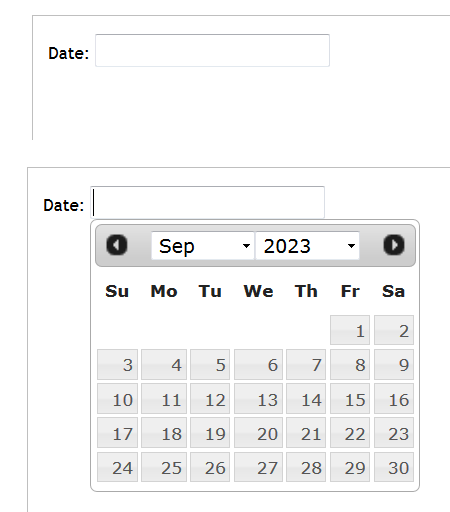
datepicker
Topics related to datepicker:
Getting started with datepicker
The datepicker is a graphical user interface widget which allows the user to select a date from a calendar and/or time from a time range. The typical practice is to provide a text box field which, when clicked upon to enter a date, pops up a calendar next to or below the field, allowing the user to populate the field with an appropriate date, or provides a text box with an icon of a calendar such that when the icon is clicked on, the calendar (or time field) appears.

Check if DatePicker value is null
How to update second datepicker from first datepicker and value of dropdown field
This example has a datepicker for the 'Start Date', an input for the 'Duration' (in weeks) and a second datepicker that is disabled for user input as it is updated on change of either the first datepicker or the duration inputs.