Length Units
Remarks:
-
A whitespace cannot appear between the number and the unit. However, if the value is 0, the unit can be omitted.
-
For some CSS properties, negative lengths are allowed.
Font size with rem
CSS3 introduces a few new units, including the rem unit, which stands for "root em". Let's look at how rem works.
First, let's look at the differences between em and rem.
- em: Relative to the font size of the parent. This causes the compounding issue
- rem: Relative to the font size of the root or
<html>element. This means it's possible to declare a single font size for the html element and define allremunits to be a percentage of that.
The main issue with using rem for font sizing is that the values are somewhat difficult to use. Here is an example of some common font sizes expressed in rem units, assuming that the base size is 16px :
- 10px = 0.625rem
- 12px = 0.75rem
- 14px = 0.875rem
- 16px = 1rem (base)
- 18px = 1.125rem
- 20px = 1.25rem
- 24px = 1.5rem
- 30px = 1.875rem
- 32px = 2rem
CODE:
html {
  font-size: 16px;
}

h1 {
  font-size: 2rem;          /* 32px */
}

p {
  font-size: 1rem;          /* 16px */
}

li {
  font-size: 1.5em;         /* 24px */
}
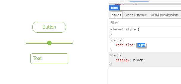
Creating scalable elements using rems and ems
You can use rem defined by the font-size of your html tag to style elements by setting their font-size to a value of rem and use em inside the element to create elements that scale with your global font-size.
HTML:
<input type="button" value="Button">
<input type="range">
<input type="text" value="Text">
Relevant CSS:
html {
  font-size: 16px;
}

input[type="button"] {
  font-size: 1rem;
  padding: 0.5em 2em;
}

input[type="range"] {
  font-size: 1rem;
  width: 10em;
}

input[type=text] {
  font-size: 1rem;
  padding: 0.5em;
}
Possible Result:
vh and vw
CSS3 introduced two units for representing size.
vh, which stands forviewport heightis relative to 1% of the viewport heightvw, which stands forviewport widthis relative to 1% of the viewport width
div {
  width: 20vw;
  height: 20vh;
}
Above, the size for the div takes up 20% of the width and height of the viewport
vmin and vmax
- vmin: Relative to 1 percent of the viewport's smaller dimension
- vmax: Relative to 1 percent of the viewport's larger dimension
In other words, 1 vmin is equal to the smaller of 1 vh and 1 vw
1 vmax is equal to the larger of 1 vh and 1 vw
Note: vmax is not supported in:
- any version of Internet Explorer
- Safari before version 6.1
using percent %
One of the useful unit when creating a responsive application.
Its size depends on its parent container.
Equation:
( Parent Container`s width ) * ( Percentage(%) ) = Output
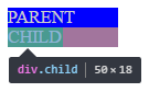
For Example:
Parent has 100px width while the Child has 50%.
On the output, the Child's width will be half(50%) of the Parent's, which is 50px.
HTML
<div class="parent">
   PARENT
   <div class="child">
     CHILD
   </div>
</div>
CSS
<style>

*{
  color: #CCC;
}

.parent{
  background-color: blue;
  width: 100px;
}

.child{
  background-color: green;
  width: 50%;
}

</style>
OUTPUT
Syntax:
- valueunit
- 1em
Parameters:
| Unit | Description |
|---|---|
| % | Define sizes in terms of parent objects or current object dependent on property |
| em | Relative to the font-size of the element (2em means 2 times the size of the current font) |
| rem | Relative to font-size of the root element |
| vw | Relative to 1% of the width of the viewport* |
| vh | Relative to 1% of the height of the viewport* |
| vmin | Relative to 1% of viewport's* smaller dimension |
| vmax | Relative to 1% of viewport's* larger dimension |
| cm | centimeters |
| mm | millimeters |
| in | inches (1in = 96px = 2.54cm) |
| px | pixels (1px = 1/96th of 1in) |
| pt | points (1pt = 1/72 of 1in) |
| pc | picas (1pc = 12 pt) |
| s | seconds (used for animations and transitions) |
| ms | milliseconds (used for animations and transitions) |
| ex | Relative to the x-height of the current font |
| ch | Based on the width of the zero (0) character |
| fr | fractional unit (used for CSS Grid Layout) |
Contributors


Topic Id: 864
Example Ids: 4941,9480,17657,17658,17885
This site is not affiliated with any of the contributors.