Extend
Basic Example
The following Less:
.paragraph{
  font-size: 12px;
  color: blue;
  background: white;
}
.parent{
  font-size: 14px;
  color: black;
  background: green;
  .nestedParagraph:extend(.paragraph){

  }
}
will compile into the following css:
.paragraph,
.parent .nestedParagraph {
  font-size: 12px;
  color: blue;
  background: white;
}
.parent {
  font-size: 14px;
  color: black;
  background: green;
}
We have applied the styles for .paragraph to the .parent .nestedParagraph element! Assuming our HTML is:
<div class="parent">
  Words
  <div class="nestedParagraph">
    Nested Words
  </div>
</div>
Our output will be
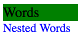
This is one way to easily apply many pre-configured styles to deeply nested components.
Extend may additionally be used with &, the parent select feature, the below compiles to the same as above.
.paragraph{
  font-size: 12px;
  color: blue;
  background: white;
}
.parent{
  font-size: 14px;
  color: black;
  background: green;
  .nestedParagraph{
    &:extend(.paragraph);
  }
}
Multiple extends on a single selector
The following Less
.paragraph{
  font-size: 12px;
  color: darkgrey;
  background: white;
}

.special-paragraph{
  font-size: 24px;
  font-weight: bold;
  color: black;
}

.parent{
  background: lightgrey;
  .nestedParagraph{
    &:extend(.paragraph);
    &:extend(.special-paragraph);
  }
}
Will compile to
.paragraph,
.parent .nestedParagraph {
  font-size: 12px;
  color: darkgrey;
  background: white;
}
.special-paragraph,
.parent .nestedParagraph {
  font-size: 24px;
  font-weight: bold;
  color: black;
}
.parent {
  background: lightgrey;
}
With the provided html:
<div class="parent">
  Parent Words
  <div class="nestedParagraph">
    Nested Words
  </div>
</div>

<div class="special-paragraph">
  Special Words
</div>

<div class="paragraph">
  Normal Paragraph
</div>
We see the following result:
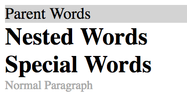
In this particular example, nestedParagraph would like to use paragraph's styles, with the overrides from special-paragraph. Styles may easily be overridden by paying attention to the order elements are extended in.
Extending nested selectors
You may also extend nested selectors. The below Less
.otherChild{
  color: blue;
}

.otherParent{
  color: red;
  .otherChild{
    font-size: 12px;
    color: green;
  }
}

.parent{
  .nestedParagraph{
    &:extend(.otherParent .otherChild);
  }
}
Will compile to
.otherChild {
  color: blue;
}
.otherParent {
  color: red;
}
.otherParent .otherChild,
.parent .nestedParagraph {
  font-size: 12px;
  color: green;
}
With the following html
<div class="otherParent">
  Other Parent Words
  <div class="otherChild">
    Other Nested Words
  </div>
</div>

<div class="parent">
  Parent Words
  <div class="nestedParagraph">
    Nested Words
  </div>
</div>
The result is
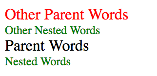
The font color for the nested paragraph is green, not blue! This shows we can extend nested selectors!
Less Extend only supports exact matching
The following Less
div.paragraph{
  color: blue;
}

*.paragraph{
  color: green;
}

.otherClass.paragraph{
  color: red;
}

.paragraph.otherClass{
  color: darkgrey;
}

.parent{
  .nestedParagraph{
    &:extend(.paragraph);
  }
}
Will compile into
div.paragraph {
  color: blue;
}
*.paragraph {
  color: green;
}
.otherClass.paragraph {
  color: red;
}
.paragraph.otherClass {
  color: darkgrey;
}
Using the following HTML
<div class="parent">
  Parent Words
  <div class="nestedParagraph">
    Nested Words
  </div>
</div>

<div class="paragraph">
  Paragraph
</div>

<ul class="paragraph">
  ul paragraph
  <li>1</li>
  <li>2</li>
</ul>

<div class="otherClass paragraph">
  Other Class Paragraph
</div>

<div class="paragraph otherClass">
  Other Class Paragraph
</div>
Our result is
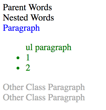
We can see that Less Extend only supports exact matching, as the Nested Words do not have styled applied to them.
Pseudo Elements
The following Less
.addDivider::before{
  content: "";
  height: 80%;
  background: white;
  width: 1px;
  position: absolute;
  top: 10%;
  left: 0;
}

.nav-bar{
  background: black;
  display: flex;
  flex-direction: row;
  width: 400px;
  .nav-item{
    color: white;
    width: 100px;
    list-style-type: none;
    position: relative;
    text-align: center;
    padding: 0;
    &:not(:first-child){
      &::before{
        &:extend(.addDivider::before);
      }
    }
  }
}
Will compile into the following CSS
.addDivider::before,
.nav-bar .nav-item:not(:first-child)::before {
  content: "";
  height: 80%;
  background: white;
  width: 1px;
  position: absolute;
  top: 10%;
  left: 0;
}
.nav-bar {
  background: black;
  display: flex;
  flex-direction: row;
  width: 400px;
}
.nav-bar .nav-item {
  color: white;
  width: 100px;
  list-style-type: none;
  position: relative;
  text-align: center;
  padding: 0;
}
Using the following HTML
<div class="nav-bar">
  <div class="nav-item">one</div>
  <div class="nav-item">two</div>
  <div class="nav-item">three</div>
  <div class="nav-item">four</div>
</div>
Our result is

We have defined a default divider pseudoclass which we have added into a nested element! The white borders can now be added to other elements using extend.
Syntax:
- selector1:extend(css selector){ //other styles go here}
- selector1{ &:extend(css selector)); //other styles go here }
Parameters:
| Parameter | Details |
|---|---|
| css selector | This is any generic CSS selector, and may include .class, #id, ::pseudoElements, etc |
Contributors

Topic Id: 9706
Example Ids: 29935,29936,29937,29938,29941
This site is not affiliated with any of the contributors.